Twitch bannerNew
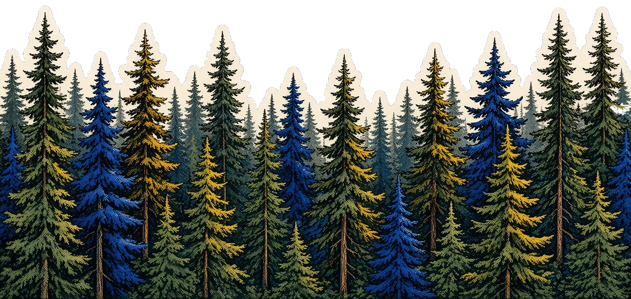
The starting-soon scene as a still Twitch profile banner. Quote, welcome card, and the pine forest. Download the PNG at 1200×480.
making coffee
“Carve that warmth into me.”
Vinland Saga
 welcome to kingcappuccinoo's stream
Crafted by Chandler King
Props
Size
Still image, 1200 × 480. Upload it as the Twitch profile banner. The bottom-left stays clear for the channel avatar.
Installation
Twitch banner is a still 1200 × 480 PNG. Upload it as the Twitch profile banner. The bottom-left stays clear for the channel avatar.
Usage
example.tsx
import { TwitchBanner } from "@/components/stream/twitch-banner";
export function Overlay() {
return (
<TwitchBanner
layout="desktop"
title="Carve that warmth into me."
badge="Vinland Saga"
/>
);
}Browser source
Paste this URL into OBS or TikTok Live Studio. The query params match the props below.
browser-source.tsx
// Still Twitch profile banner, 1200×480. Download the PNG from the component page.
const src = "https://chandlerking.dev/live/twitch-banner?layout=desktop&title=Carve+that+warmth+into+me.&badge=Vinland+Saga";The starting-soon scene as a still 1200×480 image. Nothing animates. Download the PNG and upload it as the Twitch profile banner.
Props
| Prop | Type | Default | Notes |
|---|---|---|---|
| title | string | "Carve that warmth into me." | Serif quote. Query `title`. |
| badge | string | "Vinland Saga" | Attribution under the quote. Query `badge`. |
| layout | "desktop" | "mobile" | Required | Accepted for the overlay API. The banner is always 1200×480. |
Notes & Features
- Download. The banner is a still image. Download the 1200×480 PNG from the component page and upload that file to Twitch.
- Same scene. Quote, welcome card, credit, and the pine forest, in the starting-soon arrangement. The banner is the still version of that scene.
Manual installation
Rather than the browser source, copy Twitch banner into a project. Install its dependencies, then copy all 3 files into the matching path.
Source files
src/components/stream/twitch-banner.tsx
import { BannerScene, type BannerLayout } from "@/components/stream/banner-scene";
import { STREAM_COPY } from "@/config/stream-copy";
import type { StreamLayout } from "@/config/stream-components";

const DEFAULTS = STREAM_COPY["twitch-banner"];

/** Starting soon, fitted to Twitch's 1200×480 profile banner. */
export const twitchBannerLayout = {
  width: 1200,
  height: 480,
  forestTop: 0.4,
  showForest: true,
  statusSize: 0.0122,
  quoteSize: 0.027,
  badgeSize: 0.009,
  welcomeSize: 0.0104,
  creditSize: 0.009,
  avatarSize: 0.026,
  quoteGap: 0.012,
  badgeGap: 0.014,
  cardGap: 0.016,
  cardPadX: 0.01,
  cardPadY: 0.007,
  cardGapX: 0.01,
  creditGap: 0.012,
  textPad: 0.012,
  status: "making coffee",
  welcome: "welcome to kingcappuccinoo's stream",
  credit: "Crafted by Chandler King",
  filename: "kingcappuccinoo-twitch-banner.png",
} as const satisfies BannerLayout;

export function TwitchBanner({
  title = DEFAULTS.title,
  badge = DEFAULTS.badge,
}: {
  layout: StreamLayout;
  preview?: boolean;
  title?: string;
  badge?: string;
}) {
  return <BannerScene layout={twitchBannerLayout} title={title ?? ""} badge={badge ?? ""} />;
}
src/components/stream/banner-scene.tsx
import type { CSSProperties } from "react";

import { OverlayRoot } from "@/components/stream/overlay-root";
import { footerConfig, siteConfig } from "@/config/site";
import { cn } from "@/lib/utils";

export type BannerLayout = {
  width: number;
  height: number;
  forestTop: number;
  showForest: boolean;
  statusSize: number;
  quoteSize: number;
  badgeSize: number;
  welcomeSize: number;
  creditSize: number;
  avatarSize: number;
  quoteGap: number;
  badgeGap: number;
  cardGap: number;
  cardPadX: number;
  cardPadY: number;
  cardGapX: number;
  creditGap: number;
  textPad: number;
  status: string;
  welcome: string;
  credit: string;
  filename: string;
};

const night = {
  "--background": "#000000",
  "--foreground": "oklch(0.985 0 0)",
  "--muted": "oklch(0.269 0 0)",
  "--muted-foreground": "oklch(0.708 0 0)",
  "--border": "oklch(1 0 0 / 18%)",
} as CSSProperties;

export function BannerScene({
  layout,
  title,
  badge,
}: {
  layout: BannerLayout;
  title: string;
  badge: string;
}) {
  const quote = title.replace(/^["“]+|["”]+$/g, "");
  const titleLines = quote.split("|");
  const avatar = siteConfig.personal.avatar.src;

  return (
    <OverlayRoot>
      <div style={night} className="absolute inset-0 overflow-hidden bg-background text-foreground">
        <div
          className={cn(
            "absolute inset-x-0 z-10 flex flex-col items-center px-[6cqw] text-center",
            layout.showForest ? "top-0 justify-end" : "inset-0 justify-center",
          )}
          style={
            layout.showForest
              ? { bottom: `${layout.forestTop * 100}%`, paddingBottom: `${layout.textPad * 100}cqw` }
              : undefined
          }
        >
          <p
            className="font-mono leading-none tracking-[0.04em] text-muted-foreground lowercase"
            style={{ fontSize: `${layout.statusSize * 100}cqw` }}
          >
            {layout.status}
          </p>
          <h1
            className="max-w-[28ch] text-balance font-serif leading-snug font-medium text-foreground italic"
            style={{
              marginTop: `${layout.quoteGap * 100}cqw`,
              fontSize: `${layout.quoteSize * 100}cqw`,
            }}
          >
            “
            {titleLines.map((line, index) => (
              <span key={`${line}-${index}`}>
                {index > 0 ? <br /> : null}
                {line}
              </span>
            ))}
            ”
          </h1>
          <p
            className="font-mono leading-none tracking-[0.12em] text-muted-foreground"
            style={{
              marginTop: `${layout.badgeGap * 100}cqw`,
              fontSize: `${layout.badgeSize * 100}cqw`,
            }}
          >
            {badge}
          </p>
          <div
            className="flex w-max max-w-[88cqw] items-center border border-dashed bg-background/80 text-left"
            style={{
              marginTop: `${layout.cardGap * 100}cqw`,
              gap: `${layout.cardGapX * 100}cqw`,
              borderRadius: `${layout.cardPadY * 100}cqw`,
              paddingInline: `${layout.cardPadX * 100}cqw`,
              paddingBlock: `${layout.cardPadY * 100}cqw`,
            }}
          >
            <span
              className="relative shrink-0"
              style={{ width: `${layout.avatarSize * 100}cqw`, height: `${layout.avatarSize * 100}cqw` }}
            >
              {/* eslint-disable-next-line @next/next/no-img-element */}
              <img
                src={avatar}
                alt=""
                className="size-full rounded-[0.4cqw] bg-muted object-contain"
              />
              <span
                className="absolute -right-[0.15cqw] -bottom-[0.15cqw] rounded-full bg-emerald-500 ring-[0.16cqw] ring-background"
                style={{
                  width: `${layout.avatarSize * 23}cqw`,
                  height: `${layout.avatarSize * 23}cqw`,
                }}
              />
            </span>
            <span
              className="font-medium tracking-tight whitespace-nowrap"
              style={{ fontSize: `${layout.welcomeSize * 100}cqw` }}
            >
              {layout.welcome}
            </span>
          </div>
          <p
            className="font-mono leading-none tracking-[0.06em] whitespace-nowrap text-muted-foreground"
            style={{
              marginTop: `${layout.creditGap * 100}cqw`,
              fontSize: `${layout.creditSize * 100}cqw`,
            }}
          >
            {layout.credit}
          </p>
        </div>

        {layout.showForest ? (
          // eslint-disable-next-line @next/next/no-img-element
          <img
            src={footerConfig.artwork.src}
            alt=""
            width={footerConfig.artwork.width}
            height={footerConfig.artwork.height}
            draggable={false}
            style={{ top: `${layout.forestTop * 100}%` }}
            className="pointer-events-none absolute left-1/2 z-0 w-full max-w-none -translate-x-1/2 select-none"
          />
        ) : null}
      </div>
    </OverlayRoot>
  );
}
src/components/stream/overlay-root.tsx
import type { ReactNode } from "react";

import { cn } from "@/lib/utils";

export function OverlayRoot({
  children,
  className,
}: {
  children: ReactNode;
  className?: string;
}) {
  return (
    <div
      className={cn(
        "@container relative h-full w-full overflow-hidden pointer-events-none",
        className,
      )}
    >
      {children}
    </div>
  );
}